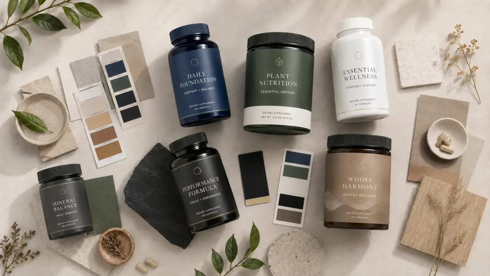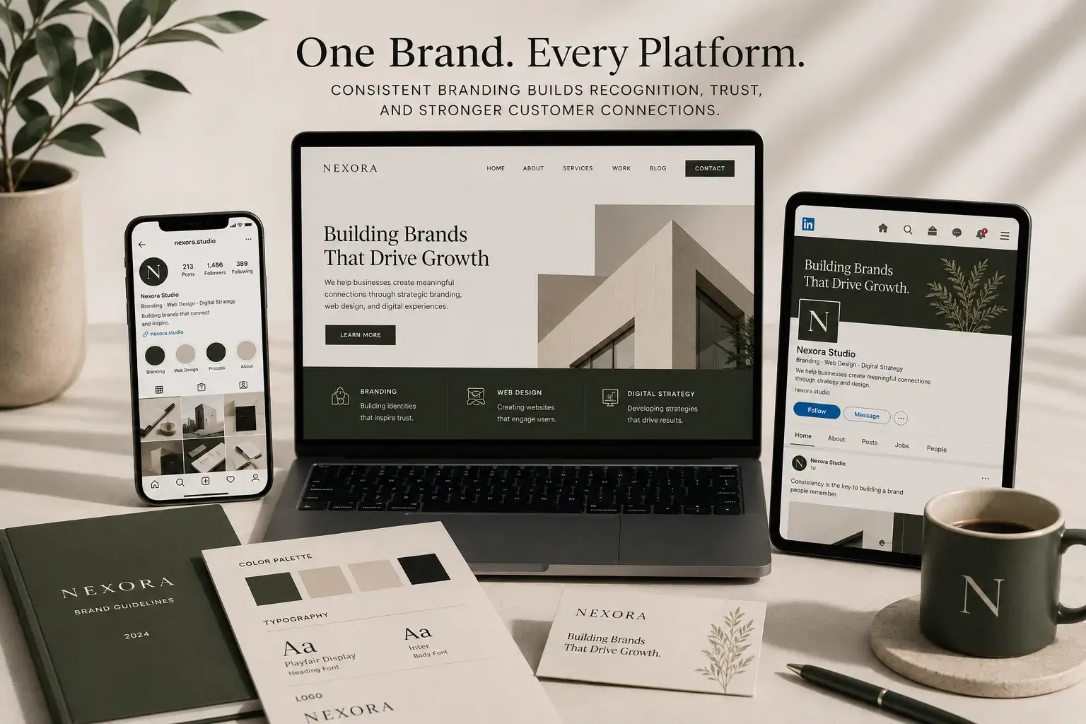

When you pick up a supplement product, is the first thing you look at really the ingredient list?
Most of the time, no.
People first decide whether the product feels trustworthy.
And they do this within seconds.
Colors, typography, spacing, visual hierarchy, whether the product feels “too aggressive” or “too cheap”… All of these elements create a perception before the customer even starts reading the label.
And in the wellness industry, perception is just as important as the product itself.
One of the biggest problems many supplement brands face today starts exactly here:
Their packaging either feels too clinical, too complicated, or simply fails to inspire trust.
Even more importantly, some packaging focuses so heavily on looking aesthetic that it completely ignores FDA compliance.
Beautiful Design Is Not Always Trustworthy Design
Creating a minimalist label is easy.
Building a premium-looking color palette is easy, too.
The difficult part is creating packaging that feels aesthetic while also remaining readable, trustworthy, and regulation-compliant.
Many brands:
- overuse claims,
- push important information into the background,
- create visual clutter,
- or overwhelm users with excessive information density.
As a result, the product starts looking “questionable” instead of premium.
Especially in the health and wellness industry, customers subconsciously ask themselves one question:
“Does this brand actually know what it’s doing?”
Packaging design silently answers that question.
What Trustworthy Supplement Packaging Has in Common
When you look at strong supplement brands, you start noticing recurring patterns.
1. Clear Visual Hierarchy
Within the first 3 seconds, users should immediately understand:
- the brand,
- what the product is,
- and its core benefit.
If everything screams at the same time, nothing stands out.
2. Controlled Minimalism
Minimalism does not mean:
“using fewer elements.”
Minimalism means:
removing unnecessary elements so the important ones become visible.
This is where whitespace becomes critical.
3. Readability
In the wellness industry, readability matters just as much as aesthetics. Ultra-thin fonts, low-contrast typography, or overly decorative text styles can reduce user trust. Supplement consumers are already used to reading ingredient panels and product information. That means accessibility of information matters.
4. Balancing Regulation and Design
Designing an FDA-compliant label is not just a legal requirement.
It is also part of building brand trust.
Missing disclaimers, misleading claims, poorly visible warnings, weak information hierarchy… All of these issues can damage the perception of professionalism.
Great Packaging Does More Than Look Good, It Creates Trust
When a customer first sees your product in a store, on Amazon, or on social media, they have not experienced your product yet.
At that moment, perception is all they have. That’s why successful supplement packaging does not only try to attract attention.
It also:
- builds trust,
- feels clear,
- looks professional,
- avoids overwhelming the user,
- and communicates that the brand knows what it’s doing.
Because in the wellness industry, people are not only buying products.
They are choosing brands they feel safe trusting.
Design That Builds Trust Before the First Purchase
At Flowora Creative Lab, we design aesthetic, user-focused, and FDA-compliant visual systems for premium wellness and supplement brands. From label and packaging design to production follow-up, we closely oversee the entire process; including laboratory coordination, sample preparation, printing, and shipping logistics.
We create a wide range of FDA-compliant packaging solutions while ensuring that every stage of the process remains visually refined, professionally managed, and aligned with your brand identity.