The Color Psychology Behind Supplements That Feel Trustworthy
Pick up any supplement that feels premium and look at the packaging before reading a single word. Chances are, the color has already shaped your impression of the product.
Color is one of the first things a customer processes. This happens within milliseconds, long before they read the ingredients, claims, or even the brand name. By the time they begin evaluating the information on the label, they have already formed an emotional response.
On a supplement shelf, that response often comes down to one question: does this product feel trustworthy?
Color psychology is especially important in the wellness industry because customers are not simply purchasing an object. They are choosing something they will put into their bodies. Before they consider the formula or the promised benefits, they need to feel that the product is safe, credible, and professionally made.
Good packaging design creates that sense of confidence at first glance. However, building trust through color is not as simple as choosing blue, green, or white. It depends on how colors are combined, how consistently they are used, and whether they support the overall positioning of the brand.
Why Color Influences Trust Before Words
Buying a supplement involves a certain degree of faith. Customers cannot immediately see whether the product works, verify the quality of every ingredient, or evaluate the manufacturing process while standing in front of a shelf.
Because of this uncertainty, the brain relies on visual shortcuts. It quickly evaluates whether the product appears credible, safe, and appropriate for its intended purpose. Color plays a major role in that judgment.
Research into consumer perception suggests that people form impressions of products within seconds, with color contributing significantly to those early reactions. In the supplement category, these reactions can be even stronger because the perceived risk is higher than it is with many everyday purchases.
A color palette is therefore more than a decorative choice. It communicates the personality, positioning, and credibility of the brand before the customer has processed any factual information. When the palette feels considered and appropriate, the customer is more likely to engage with the product. When it feels careless or confusing, even an excellent formula can be overlooked.
Blue: Safety, Calm, and Clinical Credibility
Blue is one of the most familiar colors associated with trust. It tends to feel calm, stable, and reliable, which is why it appears so often in healthcare, finance, and technology branding.
In supplement packaging, blue can suggest scientific credibility and safety. It is particularly effective for sleep products, minerals, hydration formulas, and supplements designed for consistent everyday support.
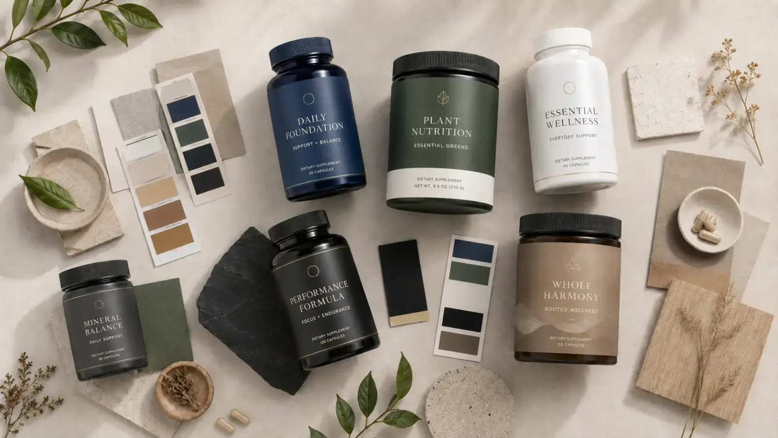
The challenge is that blue can easily become cold or generic. A packaging system built entirely around cool clinical blues may feel sterile rather than reassuring. Pairing blue with warmer neutrals, softer tones, or tactile materials can help create a more human and premium result.
Green: Natural, Healthy, and Plant Based
Green is widely understood as a symbol of nature, health, and plant based ingredients. It is a natural choice for herbal formulas, organic products, greens powders, and supplements that emphasize clean sourcing.
Different shades create different impressions. Deep forest green can feel established, sophisticated, and premium, while softer sage tones often appear modern, gentle, and calming.
The main problem with green is its popularity. It is used so frequently in wellness branding that an uninspired green palette can make a product disappear among its competitors. The color itself may communicate the right idea, but the execution still needs to feel distinctive.
White and Off White: Purity and Simplicity
White is associated with cleanliness, purity, and transparency. Generous white space can make supplement packaging feel confident and carefully considered because it suggests that the brand does not need to overwhelm the customer with visual noise.
However, pure white can sometimes feel overly clinical or impersonal. Warm whites, creams, and subtle neutral backgrounds often create a more approachable and elevated appearance while maintaining the sense of cleanliness customers expect from a health product.
The effectiveness of white also depends heavily on typography, spacing, and material quality. Minimalism only feels premium when every detail is controlled. Without that level of precision, it can quickly appear unfinished.
Black and Gold: Authority and Premium Value
Black communicates seriousness, authority, and strength, while gold is commonly associated with luxury and value. Together, they can position a supplement as premium, high performance, or exclusive.
This combination is often effective for sports nutrition, longevity products, and higher priced formulations aimed at customers who expect a more elevated experience.
The balance needs to be handled carefully. Too much gold, especially when printed with a flat or artificial effect, can make the packaging feel inexpensive. Gold is usually more convincing when used selectively for small details, finishes, or accents rather than across large areas of the design.
Earth Tones: Honest, Grounded, and Contemporary
Warm beige, terracotta, clay, taupe, and muted brown tones have become increasingly common among modern wellness brands. These colors feel grounded, natural, and calm without relying on the obvious visual language of green.
Earth tones can make a brand feel more human and less clinical, which is especially useful for products positioned around everyday rituals, holistic wellness, and lifestyle driven health.
The main consideration is contrast. Muted colors can easily blend into one another, making text difficult to read and important information less visible. A successful earthy palette still needs clear hierarchy and enough visual separation between the background, typography, and product details.
Red and Bright Orange: Energy with Restraint
Red and orange communicate energy, heat, urgency, and physical intensity. These qualities can be useful for pre workout products, metabolism supplements, and performance focused formulas.
However, strong red is risky in a category where safety and trust are central. Large areas of bright red may feel aggressive, overly promotional, or similar to a warning sign.
These colors are often more effective when used as controlled accents. A small amount of orange or red can add energy and distinction without overpowering the overall sense of credibility.
Trust Comes from the Combination, Not a Single Color
No individual color can make a supplement brand trustworthy on its own. Trust is usually created through restraint, contrast, consistency, and attention to detail.
A limited palette often feels more confident than a design filled with competing colors. Two or three carefully selected tones are usually enough to create a recognizable visual system while keeping the packaging clear and focused.
Readability is equally important. Customers should be able to understand the hierarchy of information without effort. When text blends into the background or the label feels crowded, the design becomes harder to navigate. That difficulty can quietly reduce confidence in the product.
Consistency also plays a major role. The bottle, outer box, website, advertisements, and social media content should all feel like parts of the same brand. A consistent visual identity suggests that the company is organized, professional, and attentive to detail. Customers may then assume that the same level of care extends to the formulation and manufacturing of the product.
Color, Trust, and Compliance Must Work Together
Supplement packaging has practical requirements that many visual discussions overlook. Color choices must work alongside mandatory label information, claims, ingredient details, and the Supplement Facts panel.
A palette may look attractive in a presentation but fail when applied to a real package. If required information becomes difficult to read because of low contrast, small typography, or an overly complicated background, the problem is not only visual. It can also create compliance and usability concerns.
The strongest supplement packaging balances visual appeal with clarity. It feels premium while keeping every required element legible and easy to locate. This balance between beauty and real world requirements is one of the most important foundations of consumer trust.
Common Color Mistakes That Reduce Trust
Using too many colors can make a product feel chaotic and inexpensive. A crowded palette often suggests that the brand has not made clear decisions about its identity or audience.
Neon colors may attract attention, but they do not always communicate safety or everyday reliability. They can work for energetic products, although they need to be supported by a more controlled visual system.
Copying the visual language of a category leader is another common mistake. While familiar colors can help customers understand the product, excessive similarity makes a brand feel generic. Looking like everyone else may feel safe during the design process, but it often results in packaging that becomes invisible on the shelf.
Low contrast typography is especially damaging. When customers struggle to read the label, the product immediately feels less considered. Clear communication is part of trust, and readability should never be sacrificed for aesthetics.
Choosing colors simply because they look attractive is also not enough. Every color should support a specific emotional and strategic purpose. Without that intention, the palette may be visually pleasant but fail to communicate anything meaningful about the brand.
How to Choose a Trustworthy Color Palette
Begin with the feeling the customer should experience when they first see the product. A brand may need to feel calm, clinical, natural, energetic, sophisticated, or accessible. Defining that emotional goal gives the palette a clear direction.
The audience also matters. A longevity supplement aimed at experienced wellness consumers should not necessarily use the same visual language as a children’s vitamin or an entry level daily supplement. Different customers have different expectations of what a trustworthy product looks like.
The final palette should always be tested in realistic conditions. Review the design at its actual printed size, in poor lighting, from a distance, and beside competing products. A palette that works on a large digital screen may lose clarity when printed on a small bottle.
Once the system is established, use it consistently. Repetition builds recognition, and recognition contributes to trust.
The Takeaway
Trust in supplement packaging begins visually. Color shapes the customer’s emotional response before the claims, ingredients, or brand story have a chance to influence the decision.
Blue can create calm and clinical credibility. Green can suggest natural health. White can communicate purity. Black and gold can elevate perceived value. Earth tones can make a brand feel grounded and human. Red and orange can introduce energy when used carefully.
The most effective palettes are not simply attractive. They are intentional, restrained, readable, and consistent. They support the personality of the brand while allowing all necessary information to remain clear.
When color is chosen with purpose, the product can feel credible from the moment someone picks it up. That first impression may be what turns casual interest into a purchase.
Looking for supplement packaging that feels premium while considering FDA label requirements from the beginning? Explore our FDA label and packaging design services or book a free 30 minute consultation.