There was a time when supplement packaging tried to speak loudly.
Bright colors, aggressive slogans, oversized headlines, complex graphics…
Products were practically screaming for attention on store shelves.
Today, however, a completely different visual language is rising in the wellness industry.
Softer colors.
Gentler transitions.
Calmer typography.
More whitespace.
Less visual noise.
But why?
Because modern wellness consumers are no longer searching only for brands that look “attention-grabbing.”
They are looking for brands that make them feel safe.
The Common Element of Modern Wellness Design: Calmness
When you look at strong wellness brands today, you notice a shared atmosphere.
Everything feels:
- slower,
- cleaner,
- more breathable,
- and more controlled.
Because the wellness industry is no longer only selling products.
It is selling a feeling.
When people buy supplements, they are often actually buying: the feeling of becoming healthier, more balanced, and more in control of their routines.
That’s why the visual language of wellness brands has shifted from creating stimulation to creating calmness.
Why the “Clean Wellness” Aesthetic Became So Powerful
The rise of the “clean aesthetic” in the wellness industry is not just a visual trend.
It is a psychological language of trust.
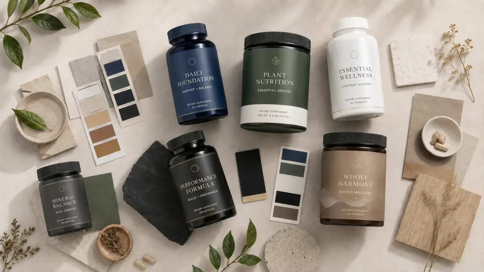
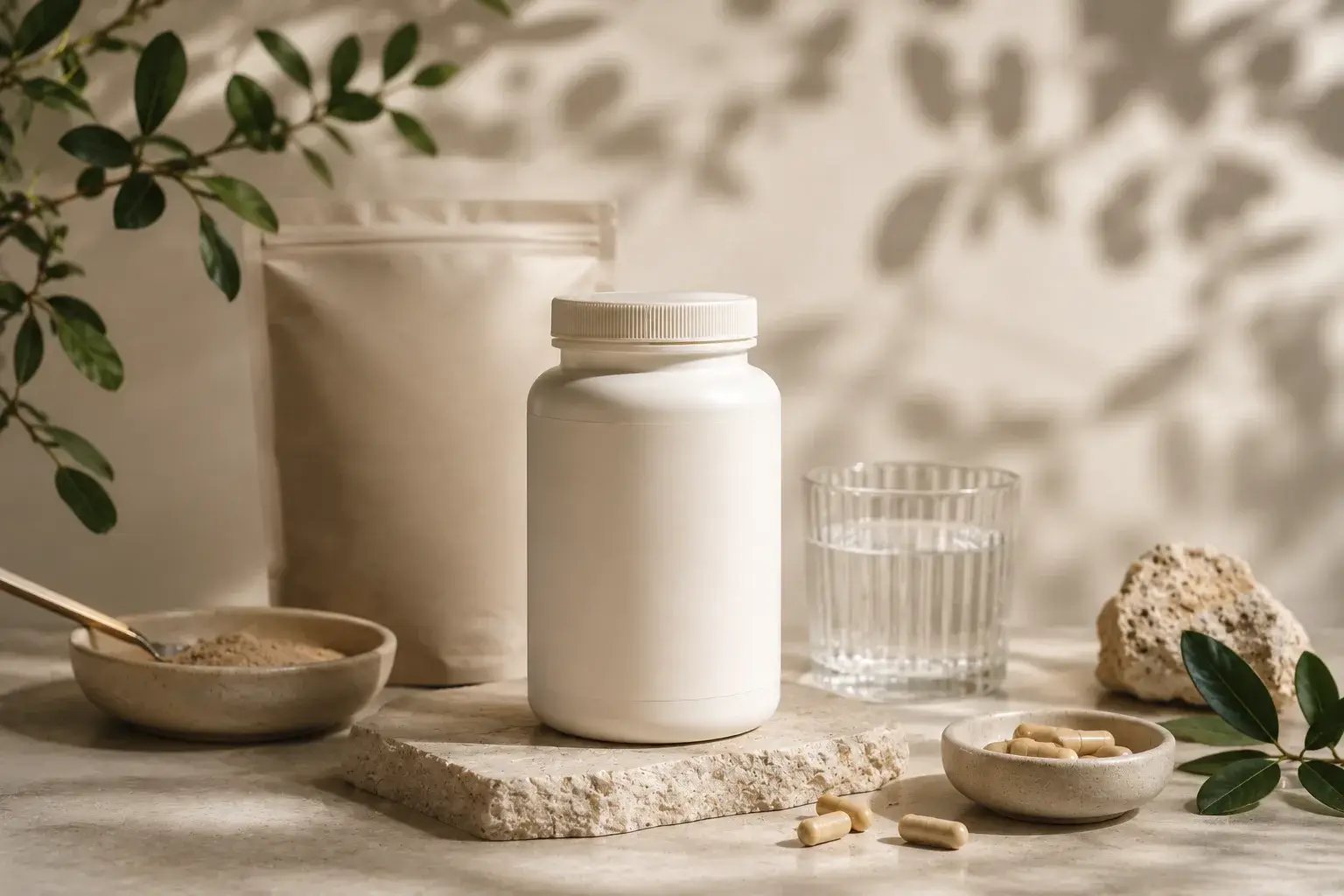
Soft tones,
natural textures,
minimal packaging,
matte surfaces,
stone, ceramic, and organic materials…
All of these elements subconsciously communicate one thing to the user:
“This product will bring balance into my life, not chaos.”
That is exactly why so many wellness brands are trying to appear calmer, softer, and more timeless today.
Minimal Design Does Not Always Mean Simple Design
Many people think minimalist design means:
“using fewer elements.”
But in strong wellness branding, minimalism is actually:
the art of removing unnecessary noise.
Because when users encounter a product, they want to understand very quickly:
- what it is,
- how it makes them feel,
- and what kind of lifestyle it belongs to.
Well-designed wellness brands communicate this without shouting.
They create a visual identity that feels quiet, yet powerful.
Packaging Design Is No Longer Only for Store Shelves
In the past, supplement packaging only needed to stand out on physical shelves.
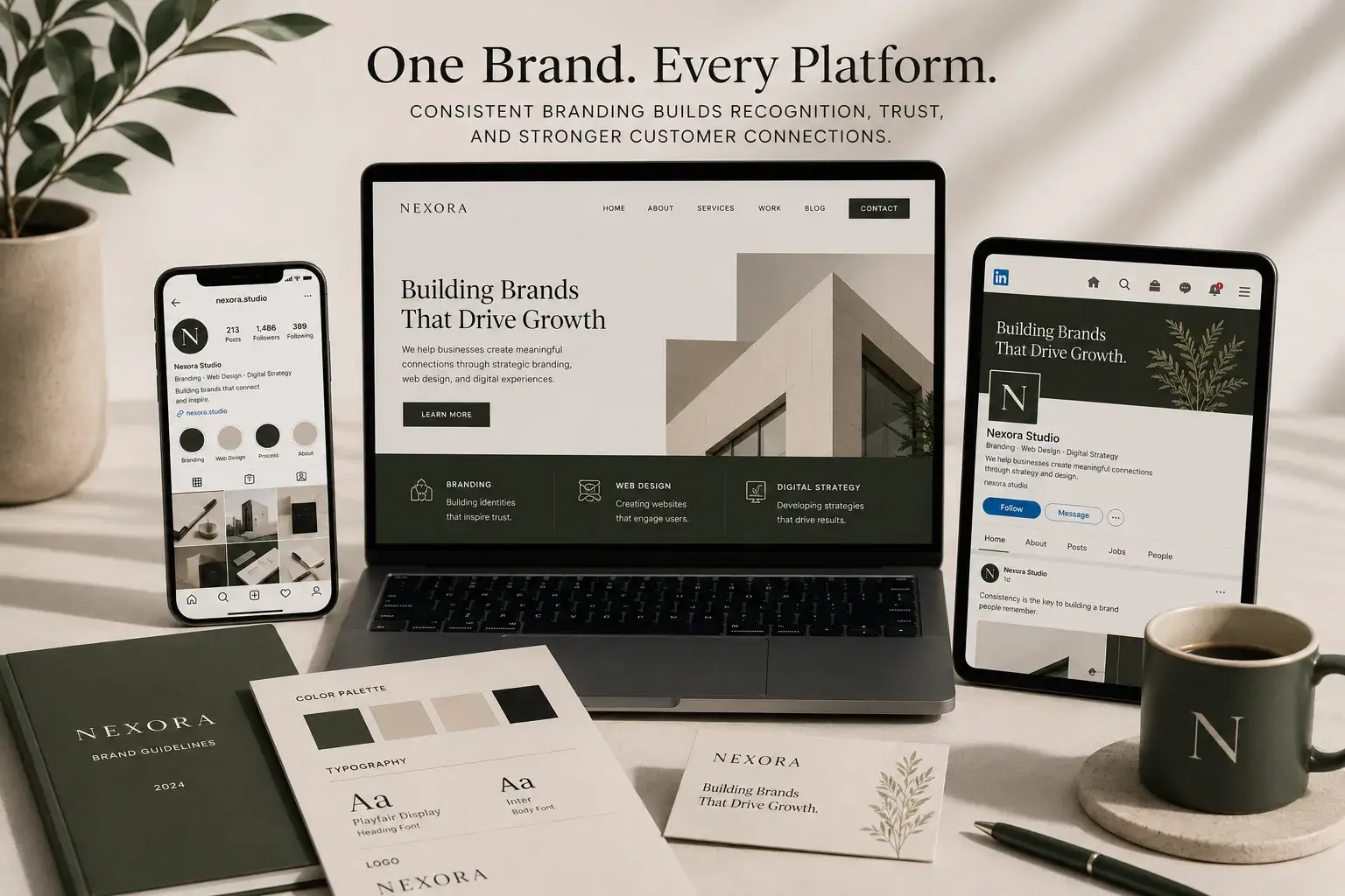
Today, products also need to appear visually strong in:
- Instagram posts,
- TikTok videos,
- website hero banners,
- UGC content,
- and influencer campaigns.
That’s why modern supplement packaging is no longer just packaging. It has become part of the brand’s content ecosystem. A strong wellness package should still feel premium when photographed, filmed, or shared digitally.
In the Wellness Industry, Trust Is a Visual Experience
Before people try a supplement product, they first see the brand. And most of the time, they make their first judgment in that exact moment.
That’s why wellness branding is not only about aesthetics, it is about designing trust.
Colors,
materials,
typography,
photography style,
product presentation,
and the overall feeling of the packaging…
All of these elements work together to answer one silent question: “Can I trust this brand?”
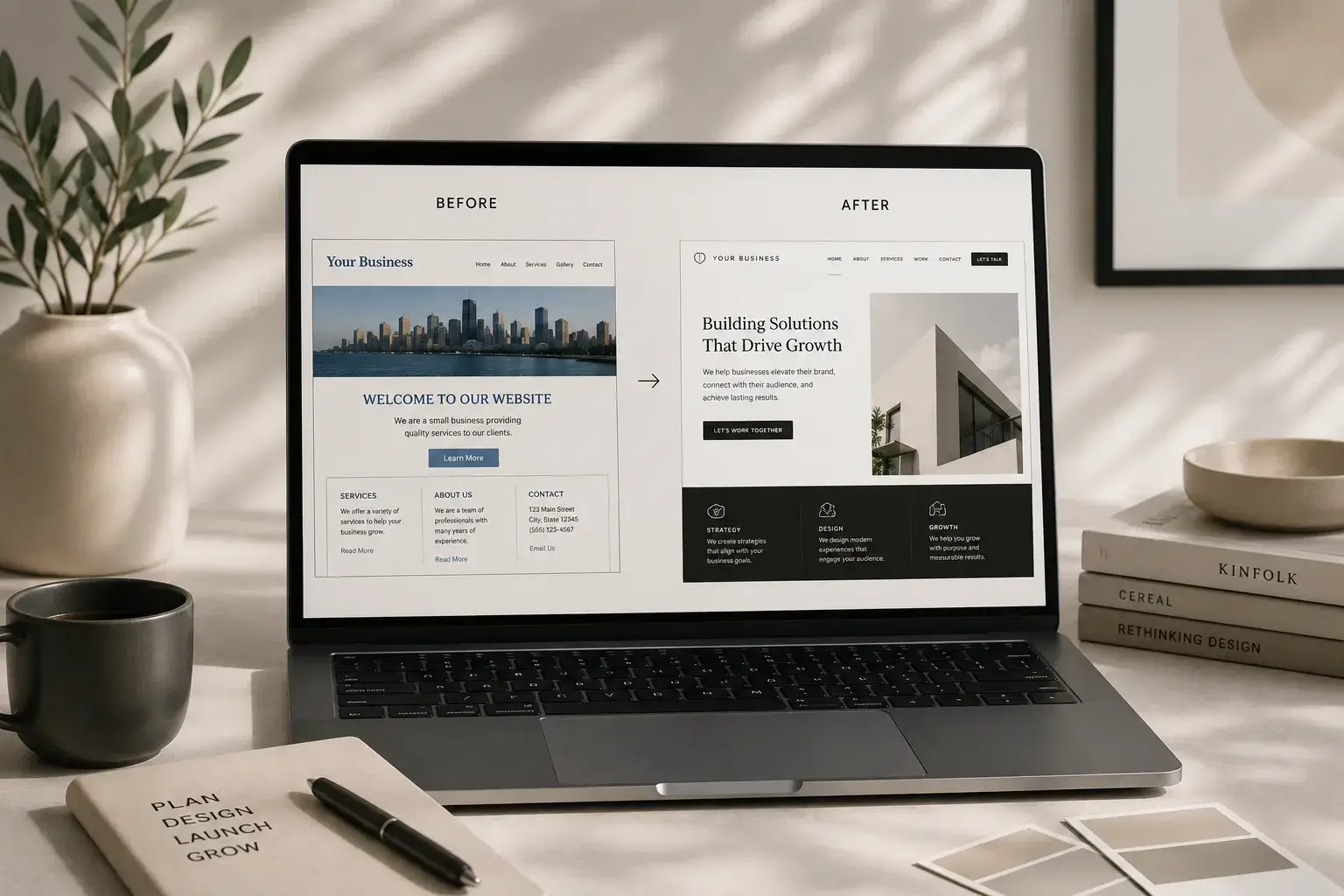
Design That Feels Clear, Trustworthy, and Premium
At Flowora Creative Lab, we develop aesthetic, user-focused, and FDA-compliant design systems for premium wellness and supplement brands. We create all types of FDA-compliant packaging designs while closely overseeing every stage of the process, from laboratory coordination and sample preparation to printing and shipping logistics. Our goal is not only to create brands that look beautiful, but also to design experiences that feel trustworthy, professional, and capable of building long-term brand value.