Homepage Redesign for B2B Juice Manufacturer
Your brand is not what you say it is, it's what they say it is.
Let’s explore how we can clearly communicate your brand’s efficiency and proven success in crafting premium organic juices.
Every element of the interface should be designed from the user’s perspective, because the user is your potential customer.
So, the real question is:
How do we want them to perceive us?
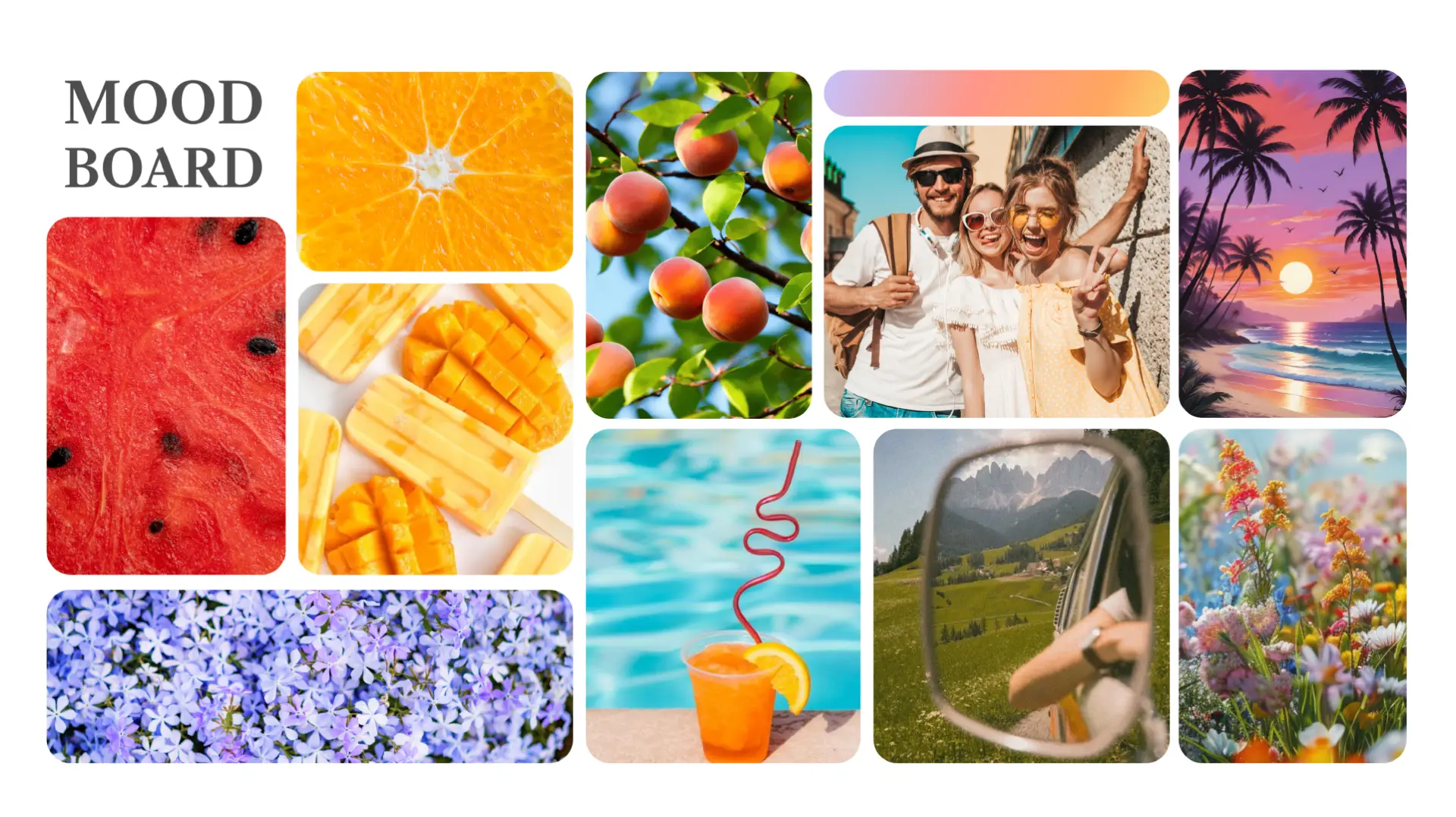
✦ Moodboard Attributes:
Energetic
Joyful
Adventurist
Carefree
Social
Fresh
Optimistic
Vibrant
Playful
✦ Previous Design UI/UX Analysis
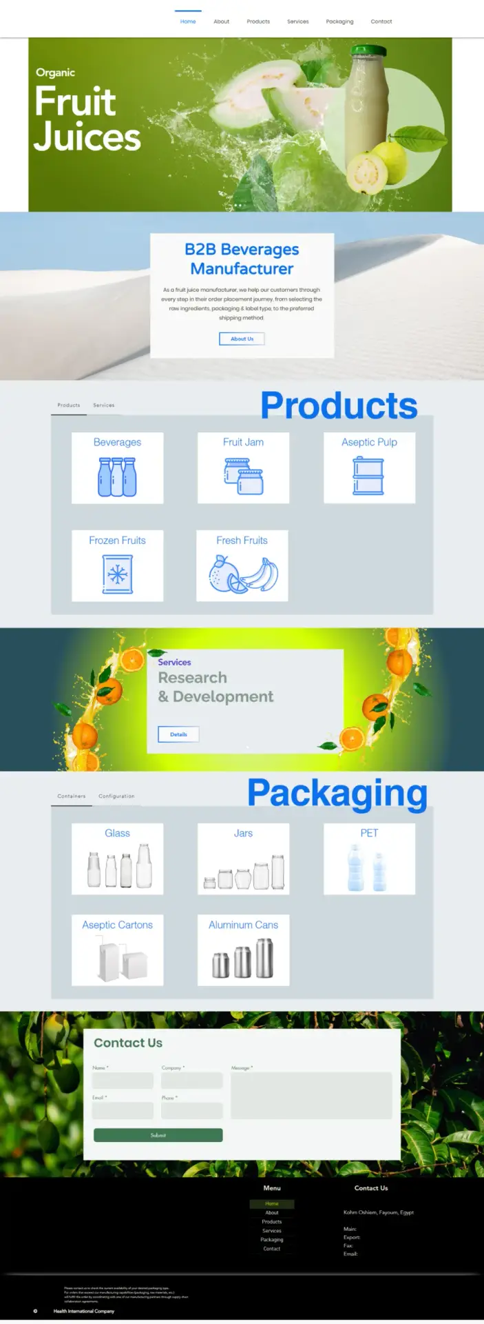
1. Header & Hero Section
The header fails to establish itself as the visual anchor of the page. It blends into the background instead of commanding attention, which weakens the first impression. A homepage should immediately signal hierarchy, authority, and brand clarity. Here, it feels passive.
A hero section should immediately answer:
Who are you? Who is this for? Why should I trust you?
Here, it hesitates.
2. B2B Beverages Manufacturer Section
The central value proposition is presented as a plain text block floating on a desert background. The problem is not the wording, it’s the delivery.
It lacks differentiation and emotional authority. Visually, the section does not elevate the statement. It feels like placeholder content rather than a strong positioning moment.
For a B2B manufacturer, this section should build credibility. Instead, it offers a neutral statement with minimal visual hierarchy. This is a missed opportunity to establish trust.
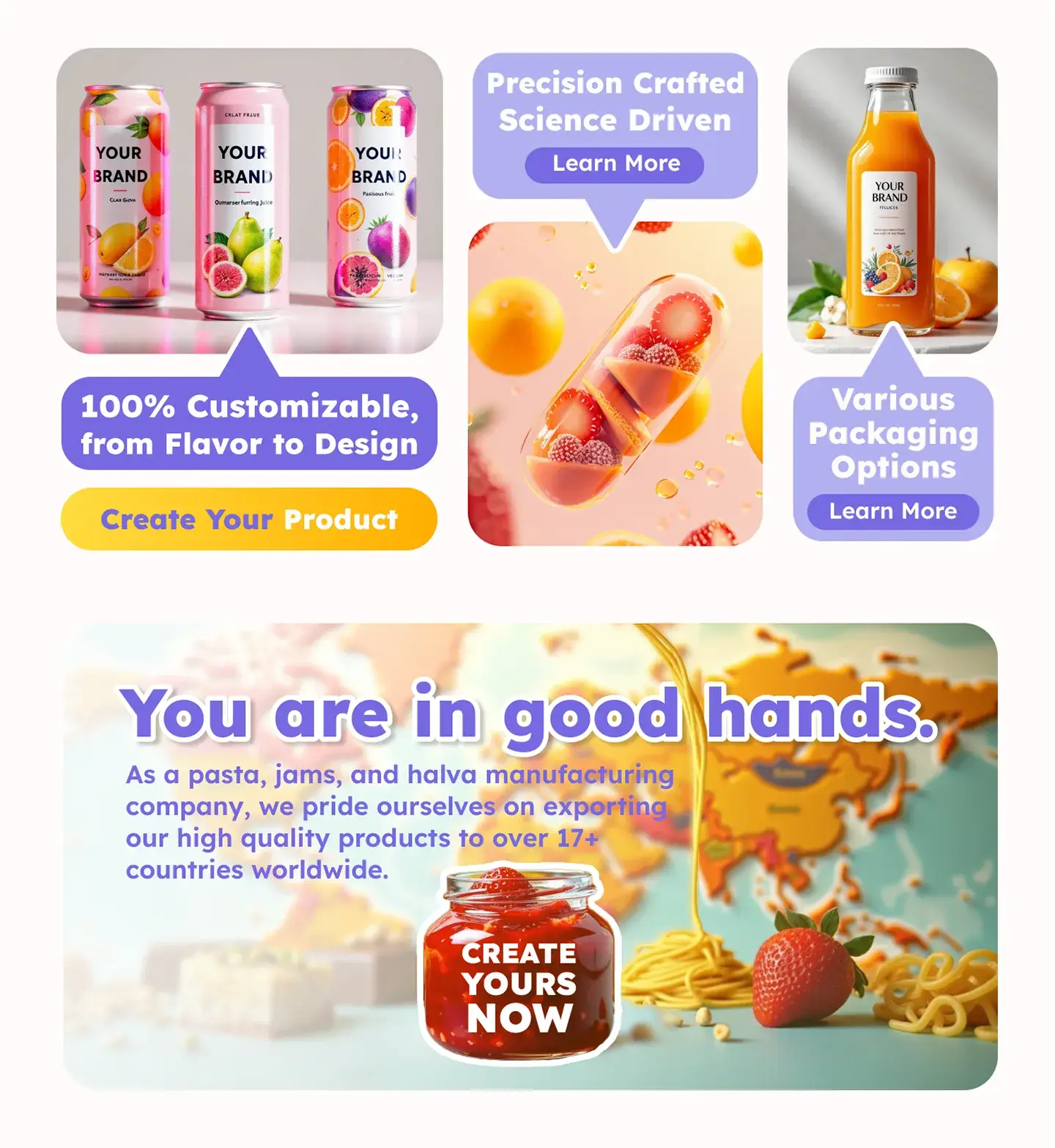
3. Product Section
The products grid relies on simplistic outline icons that feel disconnected from the brand’s identity. The icons do not communicate quality, scale, or product sophistication. They feel illustrative rather than industrial.
There is also no visual hierarchy between categories. Users cannot quickly identify what core is, what is premium, or what is specialized.
For a B2B audience, product presentation should:
Showcase texture and material quality
Highlight customization possibilities
Reinforce production capability
Instead, the section feels informational rather than persuasive. It resembles a categorized list rather than a curated product showcase.
4. Services Section
This section introduces poor, vibrant fruit splash visuals, yet the composition feels stylistically inconsistent with the rest of the layout.
The imagery dominates, but the message does not. “Research & Development” should signal innovation, technical capability, and formulation expertise. Instead, the presentation leans heavily into bad decorative visuals.
There is also limited explanatory depth. For B2B clients, R&D is often the deciding factor. This area should communicate, but the current design underplays its strategic importance.
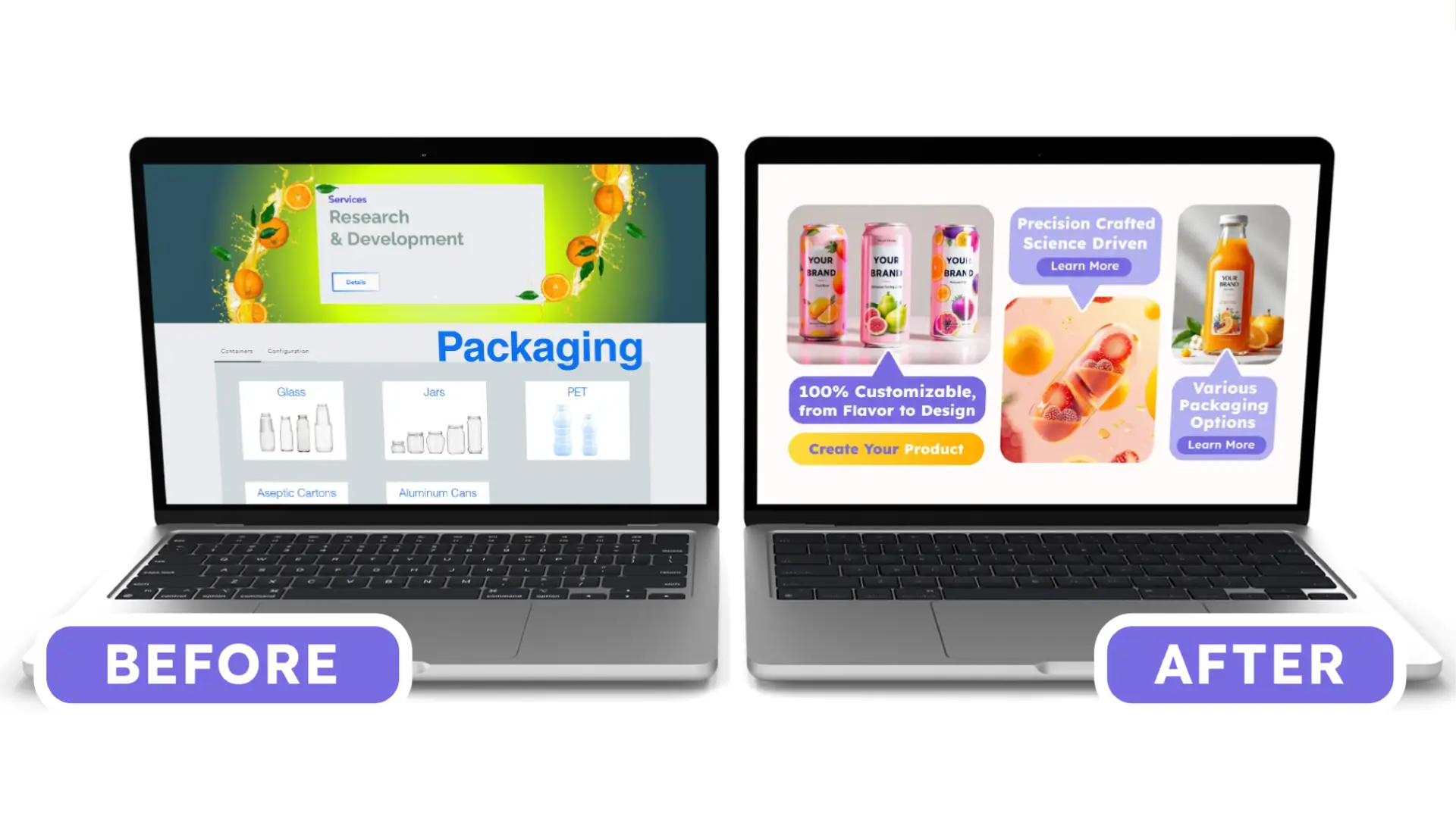
5. Packaging Section
The imagery lacks dimensionality and realism. There is no sense of scale, no contextual photography, no detail shots. It feels catalog-like, not aspirational.
A B2B client viewing packaging options should be able to imagine:
Their own brand on those bottles
Retail shelf presence
Premium positioning
The current design does not stimulate that imagination.
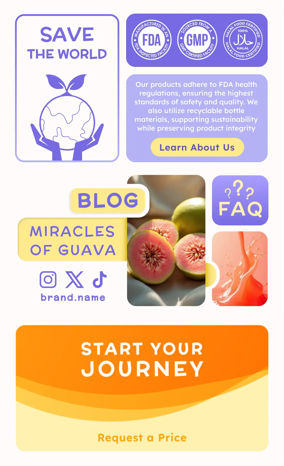
6. Contact Us
The contact form feels visually detached from the rest of the page. The layout is basic, the CTA is understated, and the section lacks urgency or incentive.
For a B2B manufacturer, the contact area is not just a form; it is a conversion gateway. It should communicate accessibility, responsiveness, and readiness for partnership.
Instead:
The form blends into the background
The CTA lacks persuasive language
There are no supporting trust elements (response time, global partners, certifications, etc.)
This reduces conversion momentum.
7. Footer
The footer does not function as a strong final touchpoint. It feels structurally separate rather than integrated. Important contact details are present, but the layout does not guide the eye effectively.
✦ Proposal
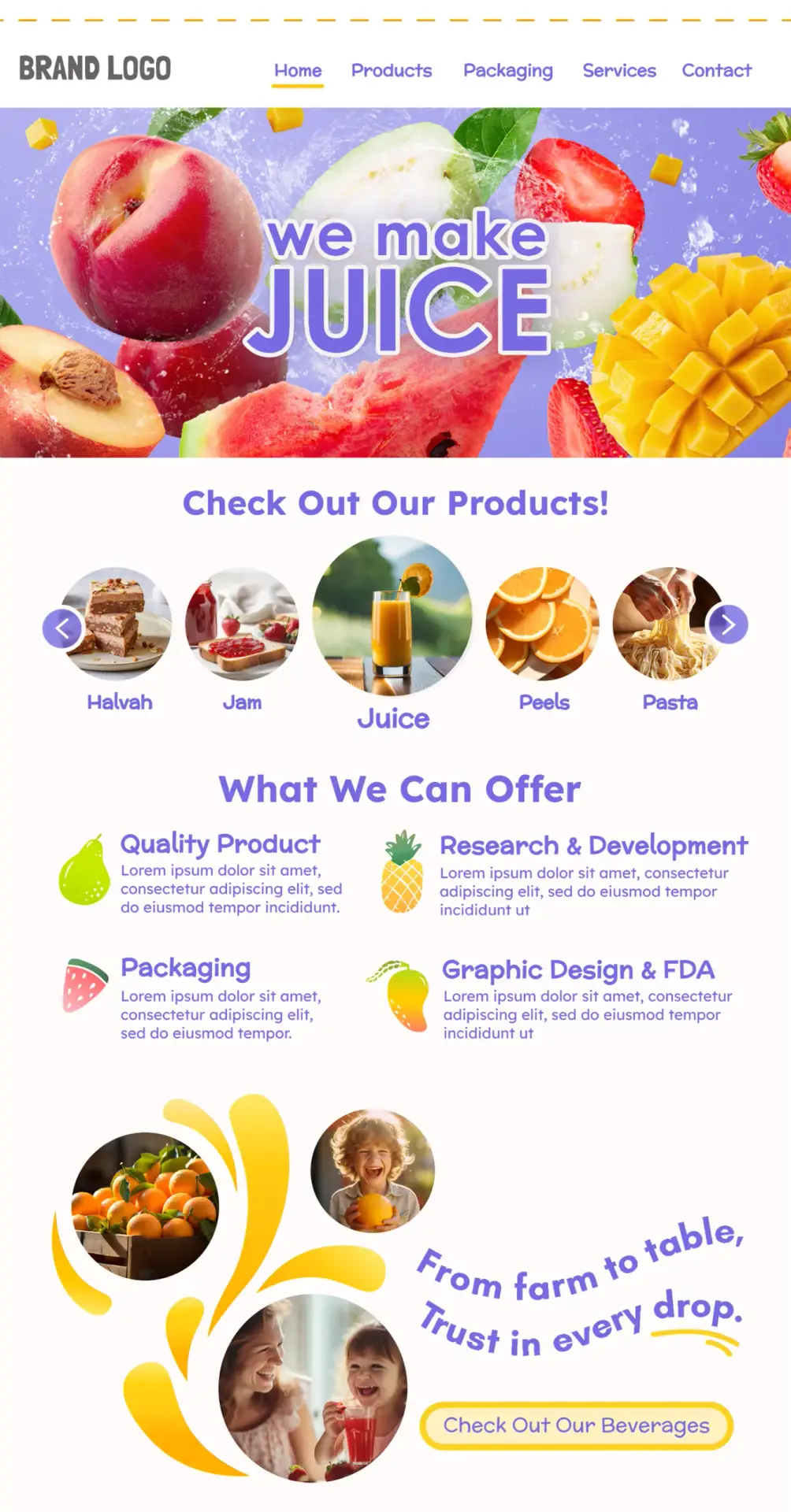
The proposed UI direction translates the brand’s core strengths into a clearer, more credible digital experience, one that feels modern, scalable, and built for conversion.
If this direction aligns with your goals, the next step is simple: let’s map your priorities and turn them into a focused implementation plan.